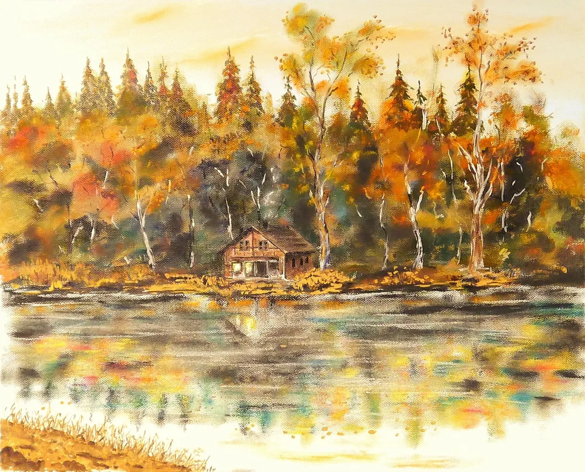
Autumn is the season British painters wait for. The woods shift from green to copper in a fortnight, the light drops low and gold, and the coast empties out. It is also a season that can overwhelm a canvas: too many colours, too much detail, and not enough dry hours before the rain returns. The trick is to decide early what the painting is actually about — the light, the texture of leaf litter, the shape of an estuary at low tide — and then keep everything else quiet.
Start With the Light, Not the Leaves
Walk into any beech wood in October and the first thing you notice is not colour, it is the way light falls through it. The sun sits low, so trunks catch a rim of warmth and hollows fill with a cool blue haze. That contrast of warm light and cool shadow is the whole painting; the leaves are just the surface of it.
Before you mix a single orange, make three or four small value sketches in grey marker or soft pencil. Squint at the scene and reduce it to three tones: light, mid, dark. If the drawing works in grey, colour will be far easier to place. Remember that the golden window is short — roughly an hour after sunrise and an hour before sunset in early autumn, less by November. Overcast days are underrated for woodland work; the light is even and the colours saturated by damp air. Wet paths and wet sand also read much darker than they look, so push those darks further than feels comfortable.
An Autumn Palette That Holds Together
The mistake is treating autumn as an excuse for maximum orange. Build the painting from warm neutrals, then add one bright accent you can use sparingly.
- Warm yellows: yellow ochre, Indian yellow, Naples yellow. Ochre is the workhorse — half your leaf litter comes from it.
- Reds and rusts: burnt sienna, transparent red oxide, a little alizarin crimson for the deepest bramble leaves.
- Greens: sap green and olive for hedges, viridian for moss and shaded grass. Mix your own dull greens with ochre plus a touch of ultramarine rather than reaching for a tube green.
- Neutrals: raw umber for branches and tree trunks, Payne's grey for marine overcast, and ultramarine mixed with burnt sienna for a smoky grey-violet that beats black for October shadows.
- One accent: cadmium orange or a warm red, saved for the focal point — a single lit leaf, a buoy, a cottage window.
Keep saturation low in the distance and higher in the foreground. That alone creates depth without any clever brushwork.
Woodland Motifs Worth Painting
You do not need a famous forest. A footpath, a coppiced hazel stool and a drystone wall are enough. Look for these:
- Beech and birch trunks catching side light, dark on one edge, warm on the other
- Bracken and fern turning rust, best painted as soft clumps rather than individual fronds
- Leaf litter on a path, dry-brushed over a warm brown underlayer
- Moss on stone, in patches of yellow-green and viridian
- Mist sitting in a hollow at first light, with treetops emerging above it
- Sheep grazing under trees, useful as small dark shapes that suggest scale
Paint leaf masses, not leaves. One confident shape of ochre, sienna and orange will read as a canopy far better than a hundred careful dabs. Use a single dominant trunk as a vertical anchor, then let the rest of the wood blur behind it.
Coastal and Estuary Scenes
The coast in autumn is quieter than the woods and cooler in tone. Skies are bigger, colours are greyer, and the season gives you reedbeds turning rust, samphire going red on the marsh, and waders feeding on exposed mud at low tide. Marram grass on dunes is an easy foreground: paint it with a rigger or the edge of a flat brush, bent in one direction, over a base of ochre and raw umber.
Two things to get right. First, the horizon line should be clean and level — a wobble is instantly visible. Second, wet sand deserves real attention, because it reflects the sky. Paint the reflection slightly darker and less saturated than the sky itself, and break it up with a few horizontal strokes. A harbour wall or a line of timber posts gives you a dark value to sit against all that pale water.
Three Simple Compositions That Always Work
The path in
A path or track in the foreground, leading to a group of trunks at mid-distance, with soft haze behind. Move the path off centre so it curves rather than slicing the canvas in half.
The big sky
For coastal work, put the horizon in the lower third and give two-thirds of the canvas to cloud. Place one small dark accent — a boat, a groyne, a figure — near a third line to stop the sky floating away.
The frame
Overhanging branches across the top corners, framing a lit field, river or estuary beyond. This works well on a square canvas and hides a weak middle distance.
Sketch all three as thumbnails about 6cm wide before you commit to canvas.
Working on Canvas: Grounds, Layers and Texture
A cotton canvas with a decent gesso layer takes acrylics and oils equally well. Toning the ground first makes a huge difference in autumn work: brush on a thin wash of burnt sienna or raw umber, let it dry, and you already have warmth showing through every later layer.
Block in with a large flat brush, keeping the shapes loose. Work from the general to the specific: sky, then the big masses, then trunks and branches, then texture. Acrylic painters can build bracken and leaf litter with dry brush over a darker layer; oil painters can glaze thin, transparent reds and oranges over dried passages to pull warmth forward without losing the drawing. Keep edges soft in the distance and sharper in the foreground, and resist the urge to fill every corner — quiet areas of grey-brown give the warm notes somewhere to sing. If you use solvents, work in a ventilated space and follow the manufacturer's safety guidance.
A Weekend Plan for Your First Autumn Canvas
- Saturday morning: walk somewhere local. Take three photographs — one of the light, one of a texture close-up, one that suggests a composition.
- Saturday afternoon: make three thumbnails in grey, choose one, and tone a canvas in burnt sienna.
- Sketch the shapes in thinned paint while the tone is still visible underneath.
- Sunday: block in colour, then spend a final hour refining only the focal point.
- Stop. Sign it, date it, and leave it on the wall for a week before you judge it.
Then paint the same view again in late November with a cooler palette — more Payne's grey, less orange — and you will learn more about season and light than from any number of new brushes.
Photo: PeterKraayvanger / Pixabay