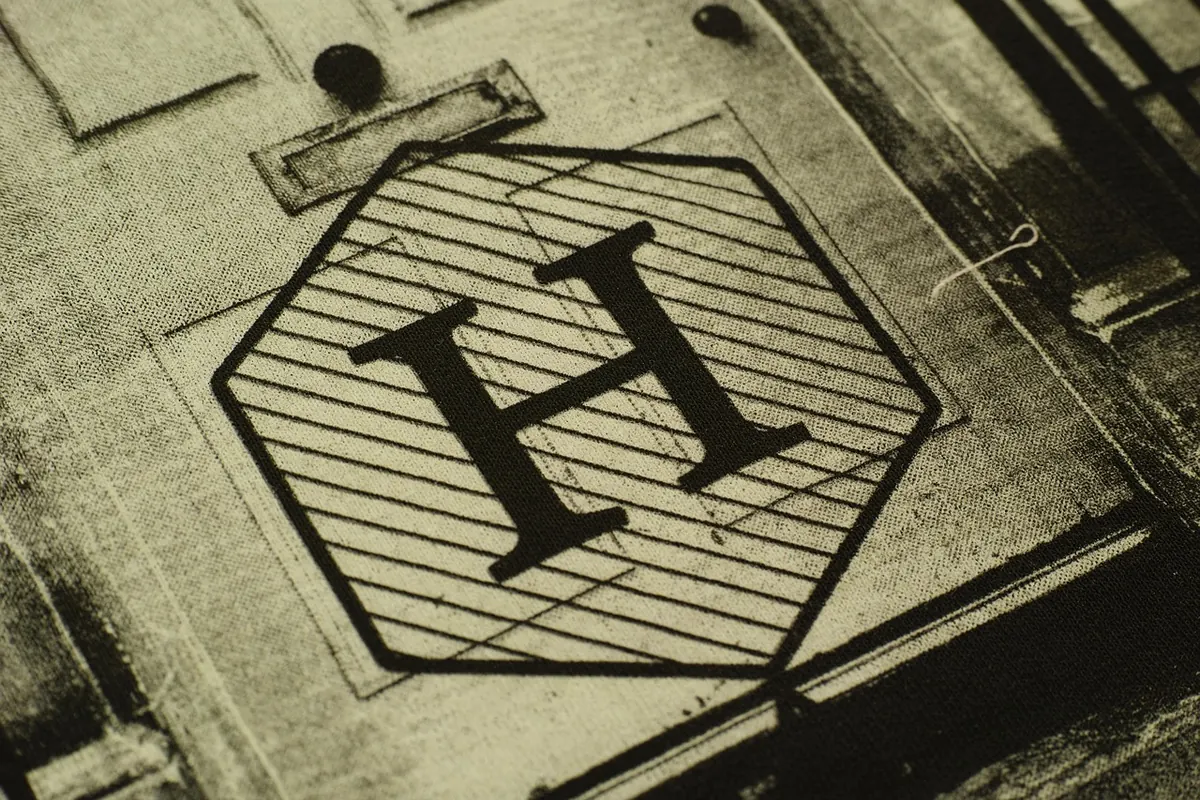
Two prints of the same photograph, hung on the same wall, can look like completely different pictures. One reads as a window into the scene; the other looks more like a painting. The difference is usually the finish. It decides how much light bounces off the surface, how deep the blacks read, whether the canvas weave is noticeable, and how forgiving the print is when the lamp is on beside you. It is also the easiest thing to overlook when ordering and one of the most annoying things to live with if you get it wrong.
Finish and build: two separate decisions
People often talk about "the finish" as though it were one thing, but there are really two choices in play. The first is the surface coating — a protective varnish sprayed over the printed canvas, which is what makes a print matt, satin or gloss. The second is the build: how the canvas is stretched and wrapped around its frame. Gallery wrap belongs to that second category, which is why it can be combined with any coating.
Most canvas prints are made with pigment inks on a cotton or poly-cotton canvas, then sealed. The coating protects the image from dust, moisture and handling, and it is also what shapes the look. So it is worth thinking about both at once.
Matt: quiet colour, almost no glare
A matt coating scatters light instead of reflecting it, so the surface stays calm even when a window or a lamp is directly opposite. That makes matt the safest choice for bright rooms, for hallways where you see the print at an angle, and for gallery walls where several pieces sit close together and you do not want them competing.
The trade-off is contrast. Blacks soften slightly, colours read a touch more muted, and the texture of the canvas weave tends to show more. On a moody landscape or a soft portrait that is flattering. On a high-contrast night shot or a punchy graphic print, matt can make the image feel flatter than you expected. Matt surfaces also show finger marks and grease more readily, so handle the edges and keep the print away from busy kitchens.
Gloss: rich colour, honest reflections
Gloss does the opposite. It reflects light like glass, which deepens blacks, lifts saturation and gives images a glossy, almost wet sense of depth. Bold subjects — sunsets, flowers, food photography, saturated abstract art — look expensive in gloss. The weave is less visible, so the print reads as an image rather than a piece of fabric.
What you gain in impact, you pay for in glare. In a room with windows on two sides, gloss can behave like a mirror at certain times of day, hiding the picture behind a bright rectangle of reflected sky. It also shows dust and fine scratches a little more. Gloss works best on a wall that is lit from the side, or in a room where you can control the light.
Satin: the practical middle ground
Satin sits between the two. It has a gentle sheen rather than a hard shine, so it holds blacks and colour depth well while shrugging off most glare. Canvas weave still shows a little, which many people like — it is a reminder that the piece is a printed textile rather than a poster behind glass.
If you are ordering one print and cannot decide, satin is rarely a mistake. It suits portraits, family photographs, landscape photography and mixed collections, and it works in rooms that are neither cave-dark nor flooded with light. It is the finish most galleries and print shops suggest by default, and for good reason.
Gallery wrap: not a coating, but a big deal
A gallery wrap means the canvas is stretched around deep wooden bars, with the image continuing over the edges so no frame is needed. It arrives ready to hang, with a clean, contemporary look.
Standard and slim wraps
A standard wrap, roughly an inch and a half to two inches deep, sits proud of the wall and casts a soft shadow, which gives the print presence. Slimmer bars look lighter and more minimal, good for narrow spaces or a neat row of small prints.
How the edges are handled
Wrapping crops the image slightly, so anything close to the border can disappear around the side. If your subject sits near the edge — a signature, a person's shoulder, a horizon line — ask for mirrored edges, where the outer pixels are flipped to fill the sides, or choose a solid coloured edge instead.
Framing later
If you think you might want a frame eventually, a slim wrap or a flat stretched canvas gives you more options than a deep one. A floating frame, which leaves a visible gap around the canvas, is a good compromise: the wrap stays visible and the piece gains a border.
Matching the finish to the room
- Bright, south-facing room with big windows: matt or satin. Gloss will fight the light.
- Cosy room with warm lamps and dark walls: gloss or satin, which come alive under directional light.
- Hallway or staircase viewed at an angle: matt, to avoid a constant sheen.
- Vivid colour or dramatic contrast: gloss or satin, to keep the punch.
- Soft, muted, painterly images: matt, which suits the quieter mood.
- You cannot see the space in advance: satin with a standard gallery wrap.
Durability and everyday care
All three coatings give broadly similar protection, so durability is rarely the deciding factor — but gloss and satin are slightly easier to wipe clean, while matt can hold onto marks. In every case, dust with a dry, soft microfibre cloth. Never spray cleaner onto the canvas, and avoid solvents, kitchen spray and anything abrasive. Keep prints out of direct, all-day sunlight and away from radiators and stoves; fading and sagging are slow processes, but heat and UV speed them up.
Very damp rooms, such as bathrooms without good extraction, are not ideal for canvas. If that is where the print is going, ask the printer about a sealed or moisture-resistant option before you order.
Choosing with confidence
Work through it in this order: decide where the print is going and how the light hits that wall, then pick the coating to suit it, then decide whether you want a frame or a bare gallery wrap. Check your image edges before confirming a wrap, and if the subject runs close to the border, choose mirrored or coloured edges.
When in doubt, satin on a standard wrap is the choice that flatters almost anything and fits almost anywhere. Order a small test print first if the piece matters — a few pounds spent on a proof is far cheaper than living with a finish that never quite settles on your wall.
Photo: Engin_Akyurt / Pixabay